Thursday Travel Photography #3 – Getting the background right + Image Reviews
This Thursday’s travel photography article has two sections. The first section is a tip on enhancing the image with careful choice of background. In the second section, let’s take a few images submitted for critique on India Travel and Photography group, and discuss about what has worked well and how they can be bettered. If you would like your images to be reviewed, add them to India Travel and Photography group pool on flikr and tag them as itpcritique.
UNCLUTTERED BACKGROUND
Most images we take tend to have a distinct foreground and background. The image of a person in the street would have the person as the main subject, with the street and buildings as background. A bird’s picture might have a perch or leaves as the background. In occasions where there is a choice, it pays to compose the image carefully in such a way that there is not too much of background clutter. A uniform or simple background keeps the viewer’s eye focused on the main subject and enhances the it considerably.
Let’s begin with an example, and then look at ways achieve this.
The Grey Tit in the first picture below is an image that would have normally made me happy. The bird is well in focus, and has taken significant portion of the frame. The feed in its beak adds well to the image. These are things that I would have liked in a bird shot. But the clutter in the background obviously doesn’t gel well with the foreground, causing undesirable distraction.

In the second image below, the clear background emphasizes the subject and doesn’t strain the viewer.

The same goes with the images of Golden Langur below. The background in the second image is a tree trunk. Since the trunk as dark, and was in shadow, it appears completely black.


So how do we go about improving the background? A few tips here.
1. Always keep a watch. Despite understanding that a good background can make a lot of difference to the image, we do not remain conscious about it all the time. Unlike the camera, our eye can easily focus on the subject and ignore the background. So the clutter in the background is not intuitively recognized at the time of shooting. One needs to keep a watch and consciously observe the background before taking the picture.
2. Use a contrasting environment. In the picture of the flower below, the flower was directly in sunlight, but the ground below was in darkness. I took the image from an angle such that the background of the image is in shadow. It helped highlight the flower and keep the background from interfering. Use such contrasting light in the picture where possible. In a better controlled environment, you can use contrasting colors (such as red background for a blue foreground) to create similar effects.

3. Throw background out-of-focus. If your camera allows you to set the aperture, you can shoot with wide open aperture to blur the background. This may not have an effect as good as a contrasting environment, but still helps a great deal in enhancing the foreground. Similar effect can also be achieved with a lens that has a high optical zoom, by shooting at longer focal length. The picture below was shot with a 400mm lens and wide open aperture. As you can see, the flower is the only object in focus. Although we don’t have a very clear background, the flower manages to stand out, since the background is out of focus.

IMAGE CRITIQUE
Below is an image posted for critique by flickr user shande
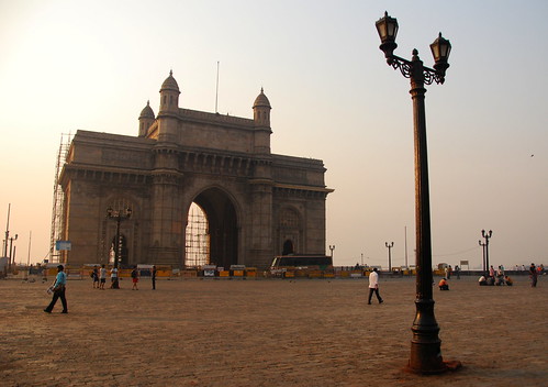
What I really like about the image is the way it is composed. There would be million pictures of Gateway of India where you see just the monument alone. In this picture, the photographer has thrown the monument to a side and has put an interesting deviation in the form of a pillar to fill the gap to the right. Yet, a viewers eye doesn’t stand for long at the pillar, and is easily lead to the monument itself.
Where I do feel that the image can be improved is in the lighting. This was shot in the morning light(as the timestamp on the image says) when the sun is already a little high and harsh. The sky to the left is slightly burnt. Also, sunlight is lighting a side and the back portions of the monument, and the front portion is in darkness. A better result would have been achieved, if the picture is taken in the evening. From the looks of it, it seems like sunlight would fall on right side and front portion of the monument in the evening hours, which would highlight the monument better.
The scaffoldings are obviously an eyesore, but not much can be done about it except coming back on another day. Here is an article I wrote on workarounds I tried with scaffoldings, which may be of use.
The image below is posted for critique by flickr user mihirrly
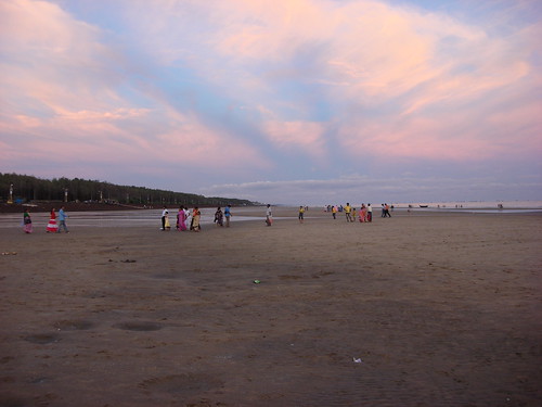
The colors of the evening sky stand out well in the picture. The image effectively conveys the feel of a wide beach where people come to relax. I feel that the shot could have been recomposed to remove a bit of the bottom portion of the sand which is not of much interest. It would also add to the image, if it was taken from a place where more of the sea could be included in the image.
If you would like one of your image reviewed next week, add it to India Travel and Photography group pool on flikr and tag them as itpcritique.