Today’s Thursday Travel Photography is slightly technical, but is important to know for everyone who shoots with a digital camera. If you are already familiar with white balance adjustments, feel free to skip this section.
The second part of this article has weekly image reviews. If you would like to have your images reviewed to know what worked well and how it could have been improved, choose some of your best images and post them on group pool of India Travel and Photography. Don’t forget to tag them as itpcritique, so they can be chosen for review. You can also post your questions related to photography as a comment to this post, or in India Travel and Photography group discussion. I will answer them in next week’s article.
WHITE BALANCE
Sometimes you would have noticed that a picture you have taken has a tint of blue or yellow. Although it is unnoticeable or doesn’t exist in most pictures, a few images may turn out so blue that it spoils the photo, and makes you wonder where did it come from. The answer lies in white balance.
Most light sources that we normally see, except daylight, tends to have a tint. For example, tungsten light has a yellow tint. Early morning light before sunrise tends to have a bluish hue. Evening sun, before and after sunset has a colour varying from orange to red. Sometimes when the colors are very saturated, we notice it easily, such as in case of a colourful sunset. But after a few minutes of getting adjusted, our eyes adapt well enough that we don’t explicitly notice the tint.
However, when taking pictures, the camera needs to make some compensations to ensure that photograph doesn’t register a tint influenced by the light source. Nearly all digital cameras have inbuilt processing capacity to compensate for the light hues, ensuring that the picture you have taken simulates the colours that the objects would have in a neutral light source. This is called White Balance Compensation.
Sometimes cameras may not be able to compensate accurately in some environment, resulting in incorrect and artifical looking hues in the picture. Look at the example below.


The above image is of a rock in the sea, taken in the evening hours. The picture to the left is straight out of camera with auto White Balance settings. You can see an obvious tint in the image. The picture to the right has gone through some corrections on the computer to fix the white balance. As you can realize, the image to the right is closer to what one would have seen, and does not have the unnatural tint like the first.
GETTING THE CORRECT WHITE BALANCE
Thankfully, most modern digital cameras can automatically detect the color of ambient light and compensate accordingly, letting the photographer forget the complexities of White Balance. However, they may fail on occasions like in the case of picture of the rock above. In such occasions, it is necessary to make manual settings in the camera to ensure that the white balance compensation is correct.
Besides the auto white balance, most cameras provide some default white balance settings, such as ‘indoors’, ‘daylight’, ‘tungsten’, ‘cloudy’ and a few more. Make sure you check your camera manual and understand how to change these settings. Only in cases when you notice that auto white balance is not performing up to the mark and creating color casts, try to change the white balance setting depending on the environment you are in. Most of the times it should work well and reduce the color cast.
UNDERSTANDING COLOR TEMPERATURE
The hue of the ambient light, often called ‘Colour Temperature’, is measured in Kelvins. Neutral daylight is said to be at 6500 Kelvins, or 6500K. Anything less than 6500K is usually bluish in colour (also called cooler tones), and above 6500K tends to be yellowish (warmer tones). Some cameras let you define the exact colour temperature of ambient light, which allows perfect compensation. If you are shooting RAW images, the same correction that is set in camera can also be performed in RAW image processing software. This means if you are shooting RAW, it is not necessary to give significant importance to setting the white balance, as it can be corrected later.
If you are shooting jpg however, it is important to ensure that White Balance compensation in the camera is working well. It is difficult to make corrections after the picture is taken.
IMAGE REVIEWS
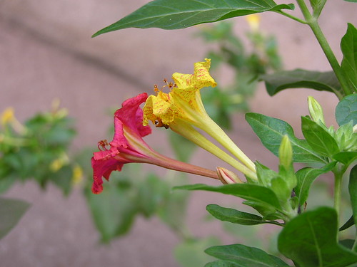
The image below is posted for review by flickr user Meghana Behere

What charmed me instantly to this picture is the different colours of the two flowers that otherwise look the same. The composition at an angle beginning from bottom-right corner works well for the image. The leaf on the top works like a loose frame and helps viewer’s eyes to focus on the flowers. There are two areas where I feel the picture could be improved. The first is the background: the mix of blue and yellow in the brownish background are a disturbance and doesn’t go well in the frame. Second, the flowers are best shot when they are in full bloom. I am not sure if the flowers in the picture are wilting already or that’s how they are in bloom, but I feel the picture would have looked better if the petals were young and not bent.
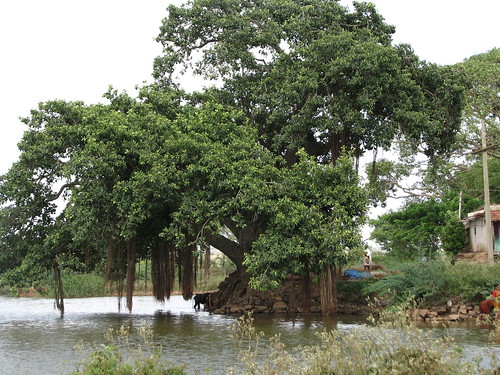
The second picture for review is posted by flickr user rajolisudhir

As I can guess from the picture, the primary focus of the image is the ficus tree and the water body. There are a few distractions in the image, like the house to the right, men standing and the blue plastic sheet on the ground. I feel it would have been better to go closer to the tree and eliminate these distractions. Shooting from a location to the right also would have helped. Personally I would prefer to go very close to the subject in a scene like this and eliminate all distractions, including the sky which is bare and white at this moment. For my suggested composition, go to the image page and see the notes.
If you would like to have your images reviewed to know what worked well and how it could have been improved, choose some of your best images, post them on group pool of India Travel and Photography and tag them as itpcritique. You can also post your questions related to photography as a comment to this post or in India Travel and Photography group discussion. I will answer them in next week’s article.
Thursday travel photography is now on for a month. I would love to get your feedbacks and suggestions on the feature, and know what more would you like to see in this column. Please comment. Starting next week, I will also be answering any questions or doubts related to photography that are nagging you. If you have a question to ask me, you can leave a comment on this post, and I will answer it next week’s article. Alternately, you can also post it as a new discussion thread on India Travel and Photography flickr group.
Today’s article has two sections as usual, with the second section on image reviews. If you would like to have your images reviewed to know what worked well and how it could have been improved, choose some of your best images and post them on group pool of India Travel and Photography. Don’t forget to tag them as itpcritique.
AVOIDING CAMERA SHAKE
In the days of film cameras when we mostly took 6×4 prints and were happy with it, camera shake was hardly an issue. Since the time the world has gone digital, we see large and magnified images on our computer, and any shake in the camera is easily visible in the photos. On many occasions we come back disappointed to see a what would have been a good picture gone bad due to camera shake. This article explains the primary reasons for camera shake, and explores ways to avoid it. The reasons first:
When we take a picture, the shutter in front of the camera’s sensor opens for a brief while and closes, letting light fall on the sensor. The time for which the shutter is open is often very small, and may be as low as 1/100 seconds, or even 1/1000 seconds or less on a sunny afternoon. The more light we have outside, the less time the camera sensor needs to create the image. In such a short time, even if there some vibration in our hands, it doesn’t reflect in the picture. However, when we shoot indoors or in the evening hours when there is not enough time, shutter speed can drop to 1/30 seconds or even less. Sometimes the shutter may have to stay open for a full second or longer to let in enough light to form a good image. In such cases where the exposure duration is long, it is impossible to keep our hands absolutely still. Slightest movement of hand becomes apparent in the picture when you see it in large size. The shake may not be obvious in a small print size like 6×4, but when you see the full image on the monitor, you will see the effects of unstable hands. Also, when we are pressing the shutter release button, our hand invariably moves a little, and can cause the camera to move.
To add to it, a zoom lens can magnify the vibrations just like it magnifies the objects in the frame. If you are shooting at a long focal length such asa 200mm or more, slightest vibration may appear prominently in the image.
Let’s look at a few ways to minimize, or completely eliminate camera shake.
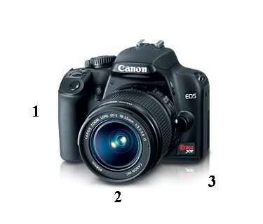
Hold your camera in the right position. The positions 1, 2 and 3 in the picture below (camera image from Canon website) show the appropriate positions for holding the camera. Most cameras have a grip(a vertical bulge with coarse surface) on the right hand side. Hold the camera here using your right hand, with your thumb supporting the back of the camera and three fingers holding the grip. Let the index finger be free to press the shutter release button.

The position of the left hand depends on how big your camera is. If it has a lens as big as the one in the picture or larger, support the lens from the bottom at the middle of the length of the lens (position 2) using your left hand. Hold the lens gently using your thumb and the index finger. If your camera is small and doesn’t have such big a lens, support the camera at the bottom left corner and hold the body gently. Do not hold very tight from either of your hands. When you are pressing the shutter release button, try to keep rest of your hand stable and gently press the button using the right-hand index finger.
If you are shooting in low light, avoid using the LCD and use the viewfinder instead. Holding the camera closer to the body allows your hand to remain stable.
Use continuous mode. Use continuous mode if your camera support the feature. In continuous mode, the camera keeps taking pictures as long as the shutter release button remains depressed. Consult the camera manual to see how this can be enabled. Some low-end cameras may not support this at all. While shooting, hold the shutter release button until two pictures are taken. The second image is likely to see less shake, as your fingers would have remained depressed and not moved when taking this picture.
Advanced Settings. If you are not shooting full auto and your camera gives you considerable creative freedom, you can increase the ISO till you feel confident about getting the right shutter speeds. The downside of this is, the image can turn out grainy due to the noise introduced at higher ISO. If your camera or lens supports some image stabilization technologies, make sure it is turned on.
Use a tripod and cable/remote release. This is recommended only for serious photographers. The effort involved in lugging a tripod is simply too much unless you are very serious about photography. While in most cases it is sufficient to use tripod alone, best results are achieved if it is used along with a remote release(a very basic remote control that does the function of shutter release button) or cable release(a cable extension with a shutter release button). In case you don’t have a cable release, it helps to put the camera on timer mode and take the picture.
IMAGE REVIEWS
The image below is posted by flickr user manisholiday

This well executed shot is perfectly exposed, which is not easy in the dark interiors of the monasteries. The colours have also come out well, and the line of lamas are well places at a side of the image. The viewer’s eyes clearly lead to the sitting lamas who are the focus of the image. The image would have come out much better if the Dung Chen(the two long instruments) were completely in the frame. With the tip cutoff, the viewer fails to get a good perspective of the length of the instrument and it feels incomplete. Besides, the round long end of the Dung Chen would also add a visual appeal to the image.
If you would like to have your images reviewed to know what worked well and how it could have been improved, choose some of your best images, post it on group pool of India Travel and Photography and tag it as itpcritique.
This is the fourth in the series of travel photography articles. See earlier articles here.
Last week we looked at how important it is to choose a suitable background while framing the shot. This week, let’s look at introducing interesting foregrounds in the image. Also, let’s look at three images that have been submitted for review this week. If you would like your images reviewed, to know what worked well in the image and how it could have been bettered, post your images on India Travel and Photography group pool on flickr and tag them as itpcritique.
CHOOSING INTERESTING FOREGROUNDS
Sometimes it is easy to get a good picture of your subjects, simply because the subject is so beautiful that you can’t go wrong. Taj Mahal is a good example. Or it could be any well known mountain or a famous waterfall. While your photograph would be just fine by itself, it may not stand out or not have any personal memories etched into the image, simply because it is just one a million shots that get taken every day. Your picture of Taj Mahal would be exactly same as the ubiquitous image taken by hundreds of people who visit the Taj, and published many times over.
A great way to pep up such images is to add some interesting foregrounds to it. The choice of foreground has to be made wisely and it must fill in just the amount frame not to distract the viewer from the main subject. Let’s look at a few examples.
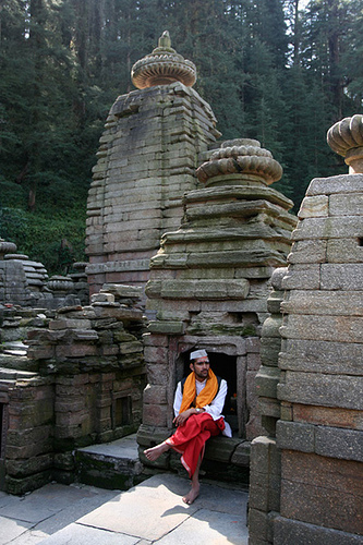
The subject of the picture here is the tall ancient temples from the small village of Jageshwar in Uttarakhand. Having taken a few images of the temples already, I was looking for something that can fill life to the image. That’s when I spotted this priest sitting on the steps in front of one of the shrines. He added a lot of interestingness and life to the image of the temples.

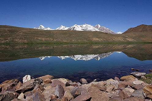
However beautiful Chandratal Lake is, I found it hard to get good images of the lake. It is a vast lake, and letting the clear lake to occupy bulk of the frame did not work very well. Its surface was very calm and reflected the sky and the mountains so well that the lake surface itself could not be seen. That’s when I thought of adding the stones in the foreground. This is what I finally got.

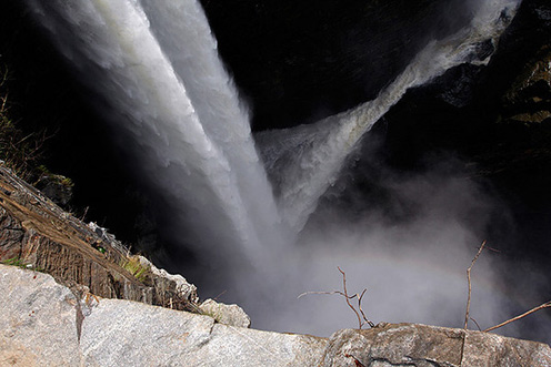
The scale and magnificence of Jog Waterfall would never have been apparent, had I not bothered to include a little bit of the cliff at the bottom of the frame. In fact, picture of the just the strands of waterfall would have left the viewer clueless about what is happening. The foreground also helps get the perspective right, and sometimes gives a sense of scale.

I stumbled on this image yesterday browsing through flickr, which would be a perfect example of using a foreground to enhance the image. The plant in the foreground by itself is not interesting, but greatly enhances the photograph as a whole.
To conclude, there are various ways by which a good foreground can improve the image. It could create a distraction that actually complements the image and makes it stand out from the typical. It can also make the viewer realize the scale, and help in getting the right perspective.
IMAGE REVIEWS
The two images below are posted for review by flickr users Prashanth M‘ and mridula respectively.


Both images are good subjects for introducing a foreground to enhance the image. While Prashanth M‘s frozen waterfall is well executed, something more to fill the bottom right portion would have improved the image. Normally, a flow looks pleasing to the eye when it moves from left to right than otherwise, but I guess such an angle would not have been possible with this waterfall. The image of lake submitted by mridula has nice reflection, and the mountains are positioned well in the image. But looking at the picture, I can’t tell how much does the lake extend to the front, and miss the scale of the entire lake. The piece of cloud sticking right on the mountain peak is also a distraction. Waiting for it to go away would have helped.

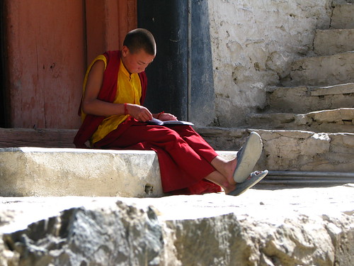
Though I was planning to review just two pictures, I could not resist posting this one, submitted by flickr user janhaviiii. A well executed image, the young monk is positioned perfectly well in the frame. The porch where he is sitting, steps leading up, the free space left in front of the monk are all that go well with the picture. The bottom portion of the image is unfortunately burnt, and is very prominent. But with the monk sitting in shadow and too much variance of brightness in the frame, this would not have been easy to prevent. One possibility to get this right would be to slightly underexpose the shot, and brighten the shadows later on the computer.
If you would like your images reviewed and know what worked well in the image and how it could have been bettered, post your images on India Travel and Photography group pool on flickr and tag them as itpcritique.
